Hero of the Sky
Illustrative Anticipation
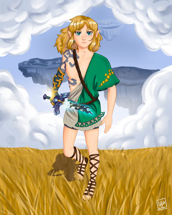
The Legend of Zelda: Breath of the Wild is a game that has inspired countless of my illustrations, and news about the release of its sequel was no exception. Hero of the Sky is an illustration I created as a result of that news (more specifically the sad news of its release being pushed back a year). Though I was disparaged by the news of a game I was long anticipating being delayed, the announcement did come with new visuals of the “master sword” in a broken state, glowing blue. I could hardly feel disappointed when such an exciting little hint about the story was given to us, even if it was just a short clip. I had previously drawn the main character, Link, in his new garb about a year prior, and I believed it would be a fun challenge to myself to create a similar drawing and see my improvement and any changes in my art style.
Tackling an Old Drawing in a New Way
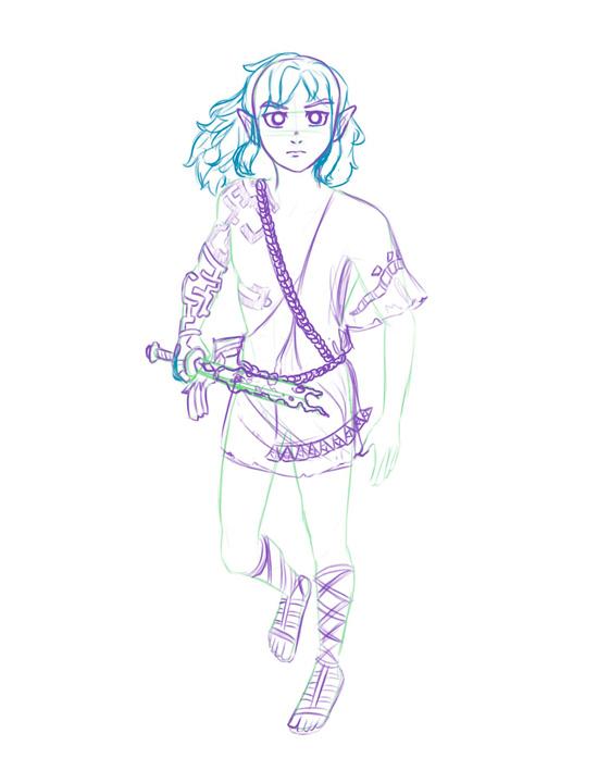
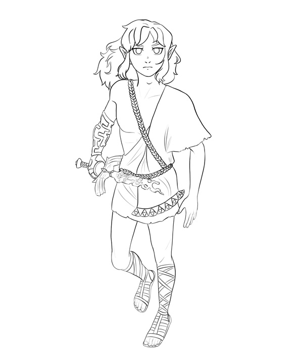
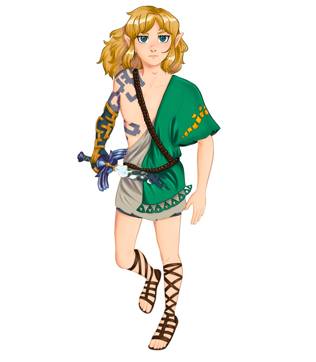
Because I wanted to see the differences in my artistic ability, I chose not to lean too much on the previous drawing of the same concept. I didn’t use the older illustration as a reference for this one, instead drawing from new references to get a fresh view of each element of Link and his clothing. At this point in time, I was between using a couple of different rendering styles. One was a more flat style, with hard edges and lighting to achieve a brighter, less-realistic look. The other was a more heavily rendered style, using painterly brushes and soft blending to make more realistic forms. After finishing the line work and flat colours, I had to choose between these two styles.
Less is More
Once settled on the more heavily rendered style, the illustration started coming to life and the improvement from the last drawing became visible. This time around, I used a three-dimensional model to aid in creating a more dynamic pose, and the newer references helped me to see aspects of the clothing I hadn’t noticed the last time I drew it. Additionally, I opted for less-harsh lighting to give an overall brighter atmosphere that matched the fantastical and majestic setting of the illustration. It was a good exercise to see how less can ultimately be more and that heavy lighting and colour adjustments aren’t always necessary. Finally, I made the clouds frame Link to draw the eye to him and made the floating islands in the back monochromatic so they wouldn’t take away from the main subject.
What I Learned
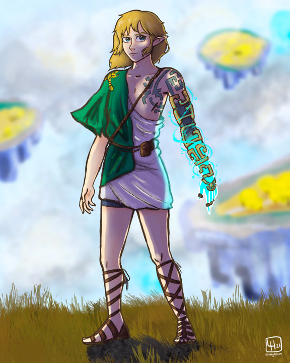
Drawing Hero of the Sky was and is, to this day, one of the best learning experiences I’ve had illustrating a piece. It wasn’t the first time I had redrawn a previous piece, nor was it the one with the most visually apparent improvement, but the process itself taught me a lot as I experimented with the style of the clothing folds, clouds, grass, and metal elements. It’s a piece I constantly go back and reference to try to stylistically replicate, as I believe it holds up with its visual hierarchy, balance, and unity.