Rush Industries Brand Identity
Dipping My Toes Into Design
The Rush Industries brand was my first experience creating a set of full brand standards, and especially formally presenting any. It was created for an assignment in my first semester of Visual Communications. All of my previous experience with brand design was for personal use or friends and mostly consisted of a single logo and some correlating colours. We were assigned to create a full brand identity with colours, fonts, multiple logo variations, and applications, all displayed in a booklet with headings and a title page. This seemed daunting at first, but I realized through the process that it would be a lot of fun and a great learning experience.
The Rush Story
I decided to create branding for Rush Industries, a fictional company that I created as part of an original story. Rush makes time travel devices for retail sale and was established in the 1970s. This hypothetical rebranding would be the company’s first since 1995. The branding was to communicate the company’s focus on scientific innovation and exploration, all while maintaining a friendly look and paying homage to their ‘70s origins.
Communicating Futurism
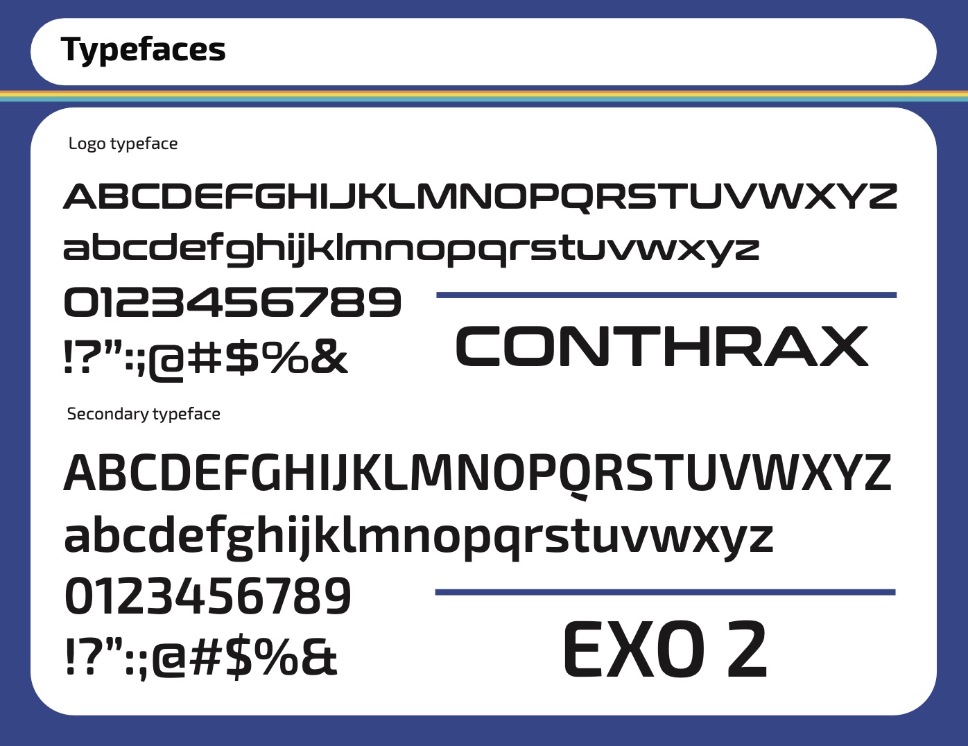
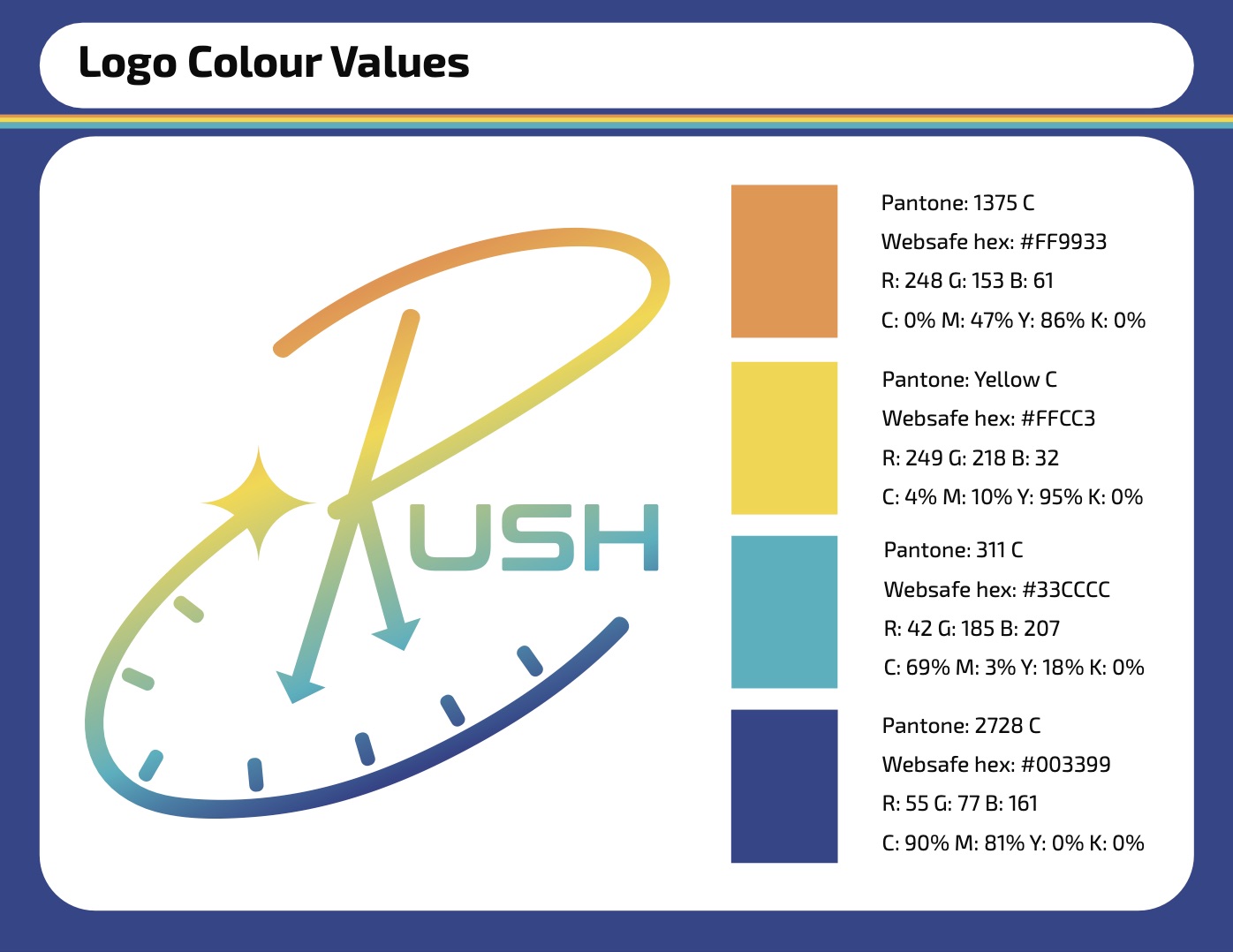
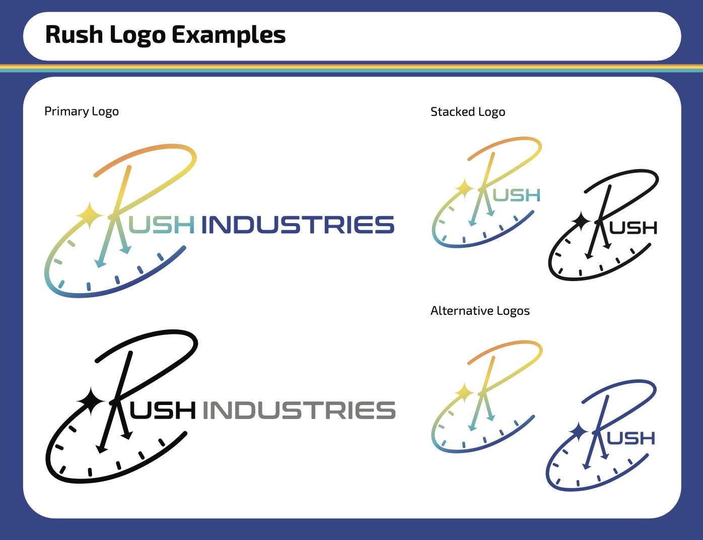
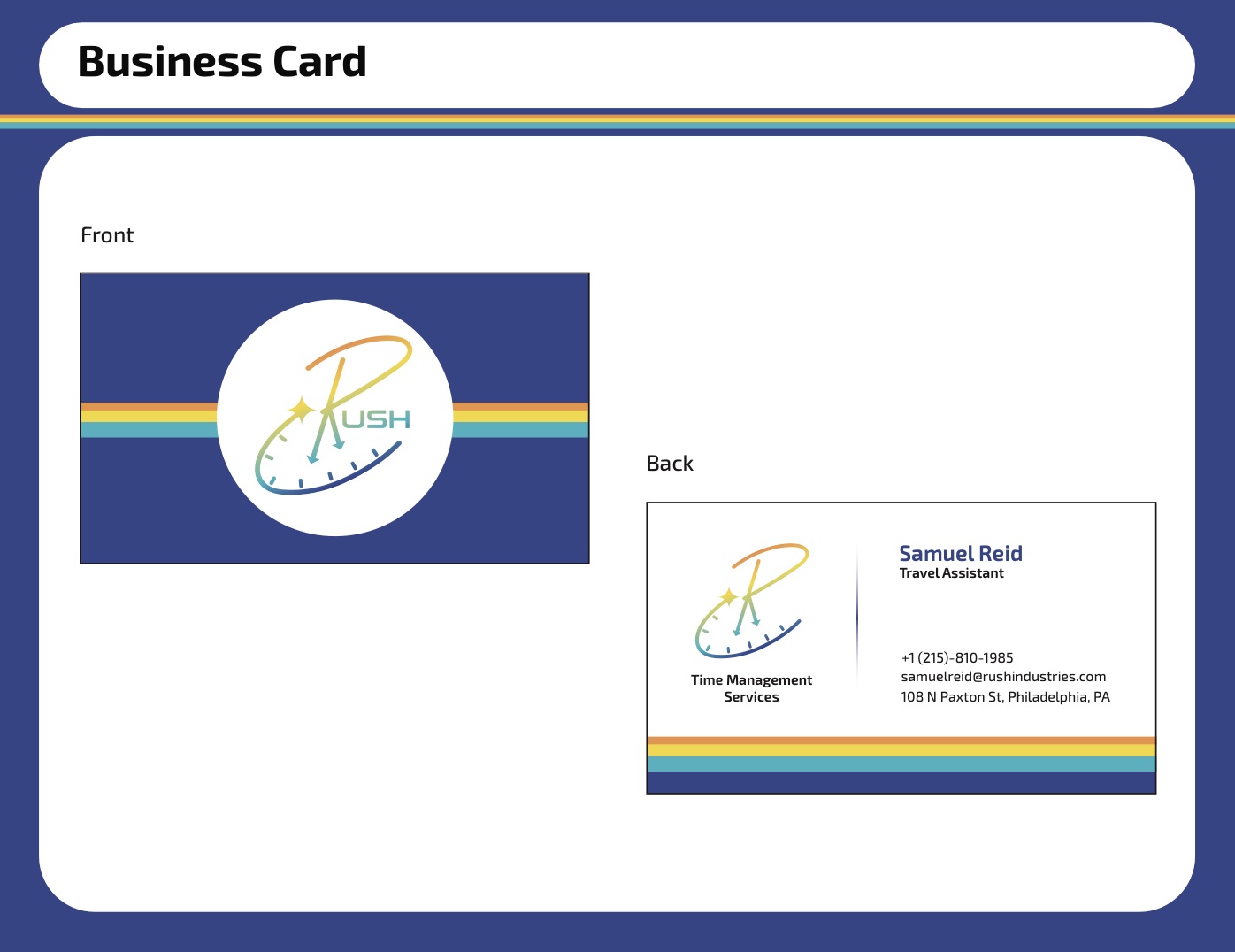
When creating the logo, I knew I wanted to incorporate imagery of a clock in some way and, after a handful of other concept sketches, I was able to come up with a design that combined the hands of a clock with the lettermark. However, I wanted to differentiate Rush from any other company selling watches, clocks, or otherwise. I added the shooting star flowing from the end of the word, circling back to the main lettermark, signifying the traversal of time and space, and the act of going back in time. The “Rush” portion of the logo, or alternatively just the “R” lettermark, act as the primary logo for applications and stacked instances. The two fonts I chose, “Conthrax” and “Exo 2”, are futuristic, yet simple and readable, and pair well together with their round curves and hard edges. The colours are reminiscent of popular fashion and graphic designs of the 1970s, with bold rainbow stripes contrasting a simple blue background. This stripe of orange, yellow, teal, and blue is used in various applications, and the colours are used in a gradient in the logo, adding a modern spin and emphasis to the “Rush” portion.
Becoming a Confident Designer
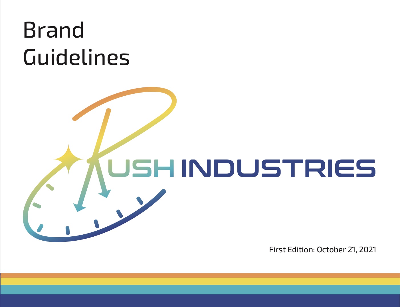
I really enjoyed creating this brand identity, which was partially due to the freedom I had in making it for a fictional company of my choice, but also because it gave me a lot of confidence in my design abilities. I had very little experience with Illustrator at the time and was feeling very unsure of how a logo, especially one with so many narrow elements, would turn out. However, I was able to produce an accurate recreation of my concept sketch, and as I familiarized myself with Illustrator’s tools, an overall professional-looking brand identity booklet. The things I learned during this process have stuck with me throughout the rest of my time using Illustrator, and I can always look back to it as an example of how I got past Illustrator’s behemoth of a learning curve and made something to be proud of.