Zippy Treats Brand Identity

The Zippy Treats Story
This brand identity system was created for a fictional company as part of a project in a storytelling for digital media class. Zippy Treats is a fictional company that delivers food from local bakeries and restaurants, focused on pastries and desserts. The branding was to communicate the company’s quick service, as well as a tone of friendliness, whimsy, and homelikeness. This identity system was specifically created for reference in a brand-awareness social media campaign, so it mainly covers the standards that should be applied to relevant posts.
Creating Zippy

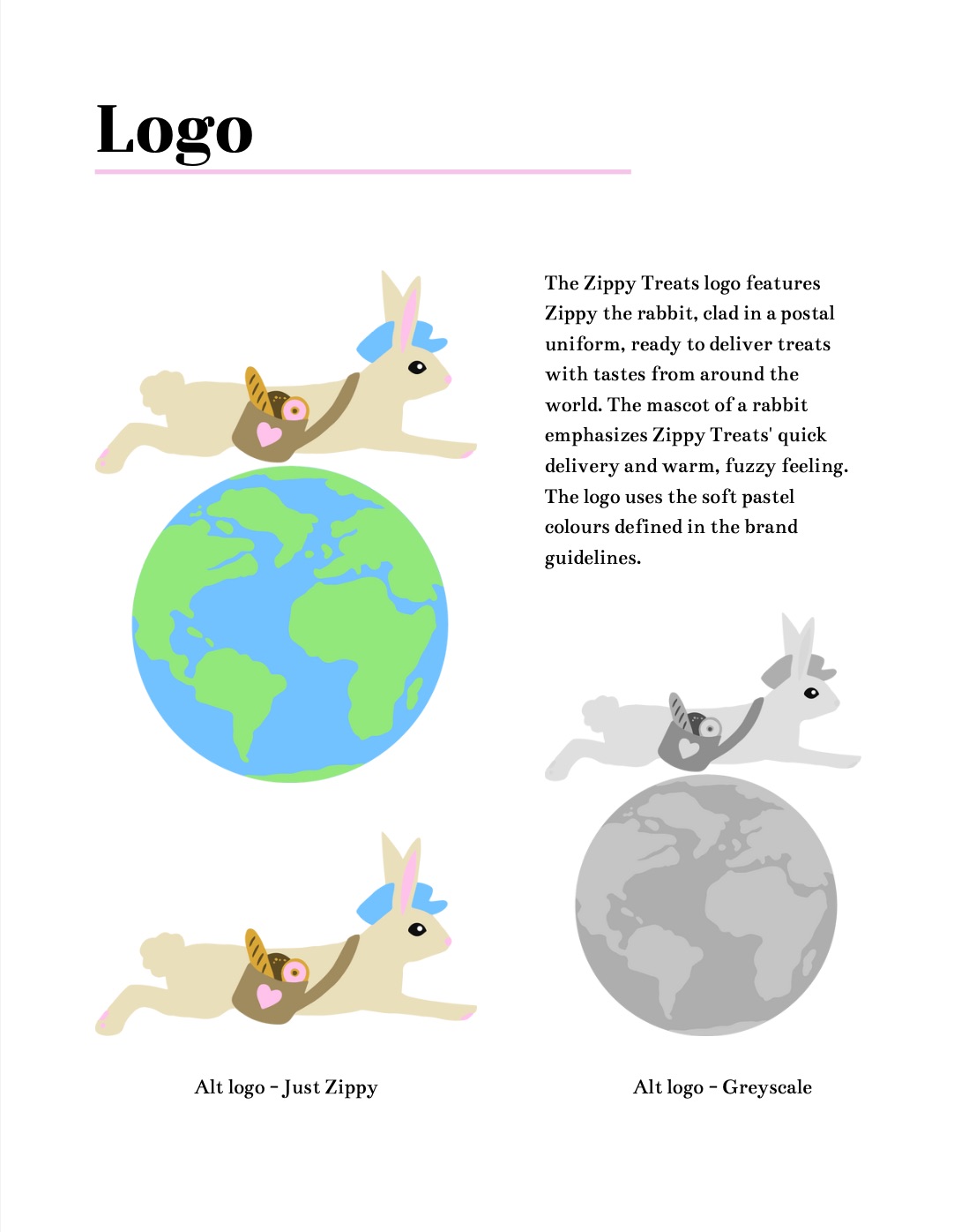
The brand’s mascot, Zippy the Rabbit, was to be an integral part of the logo. He is clad in mid-century postal wear, with treats sticking out of his delivery bag. In the full version of the logo, he’s seen above a globe, conveying the company’s focus on connecting people with their childhood homes, wherever that may be.
Colour and Type

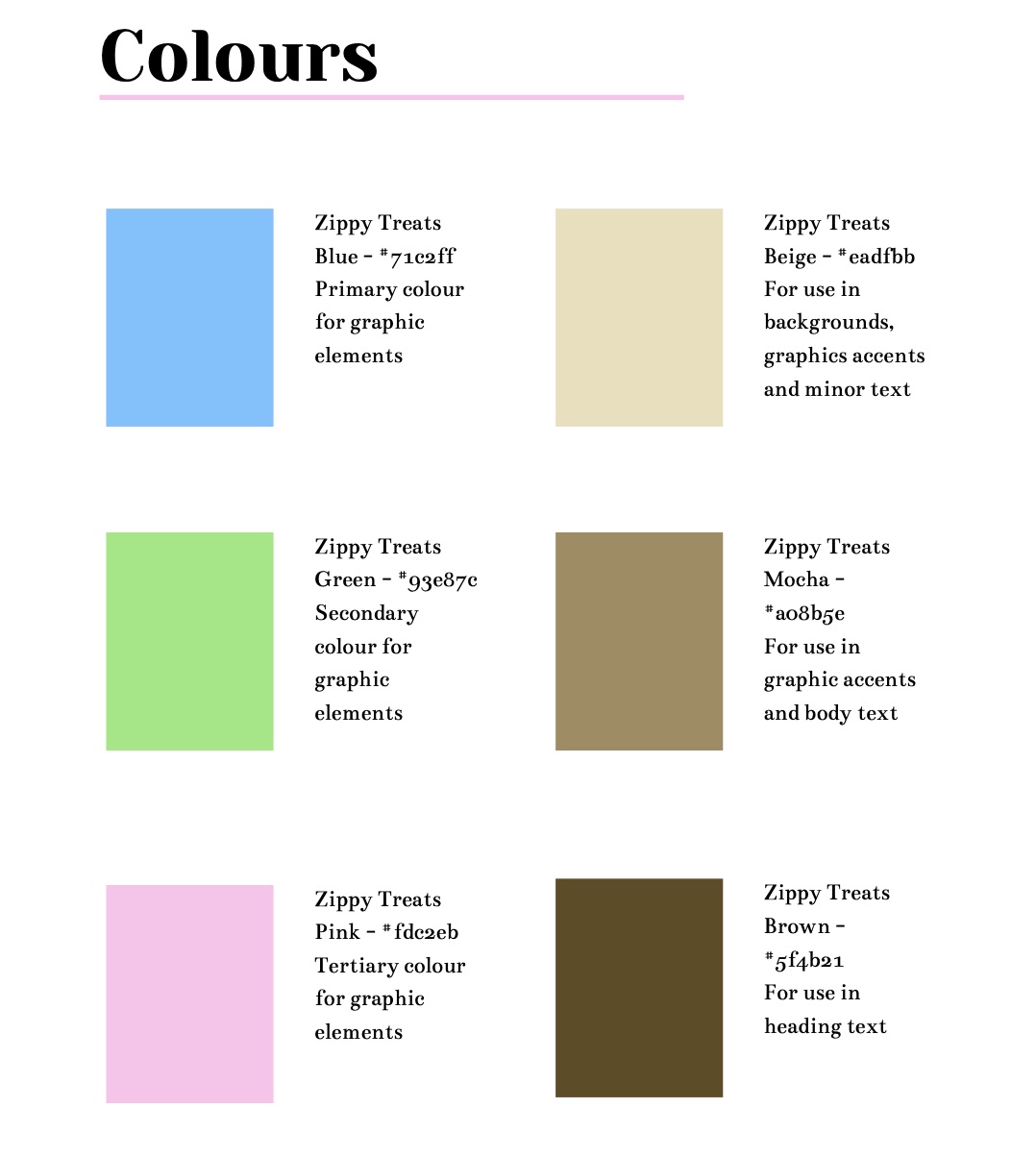
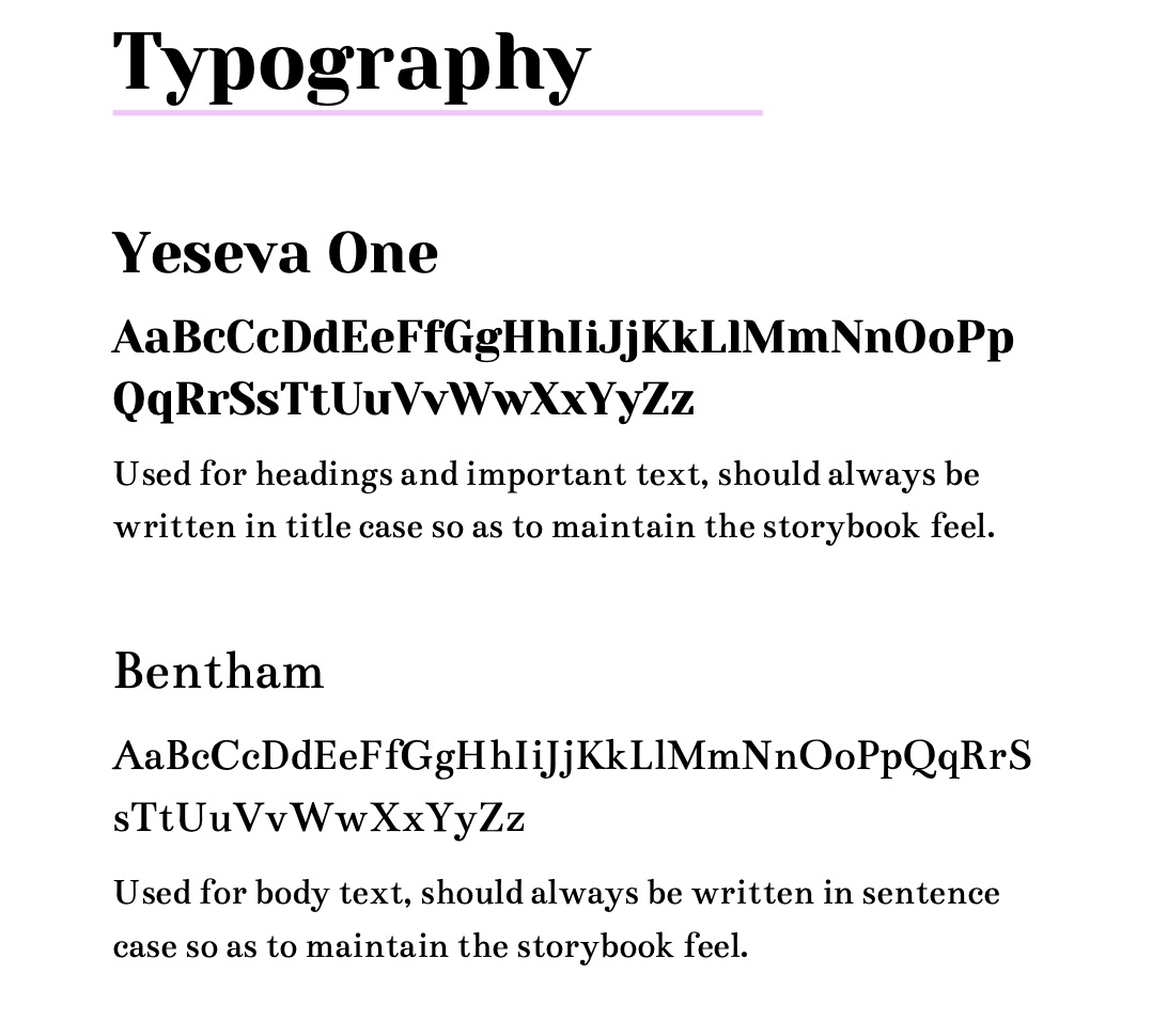
The pastel colours used enforce the friendly tone of the brand and are reminiscent of baked treats. These colours are accompanied by various values of browns that can be used for text and graphic accents, as they complement each of the three main colours. The typefaces chosen, “Yeseva One” and “Bentham”, are similar to fonts found in classic children’s books–specifically press-printed books.

Designing for Social Media

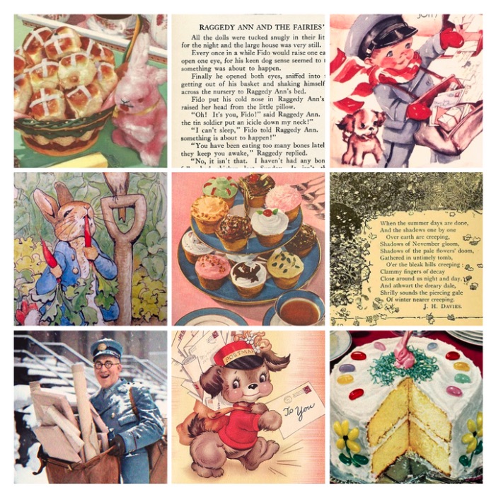
Because these standards were specifically made for social media posts, I also created a mood board as a visual guide. I choose images of storybook pages with aged paper, mid-century illustrations of postal workers and animals, and old magazine illustrations of baked goods. Seeing the brand’s tone and elements present in various aspects of the chosen images serves as inspiration for a hypothetical social media manager or graphic designer working with the company to create posts aligning with the goals of the campaign. I also provided a brief guide on the brand’s tone and how different graphical and written attributes can aid in enforcing it.